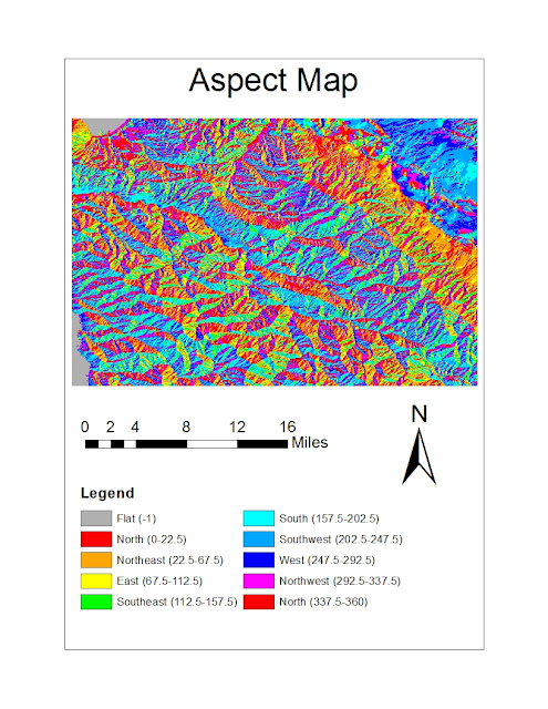
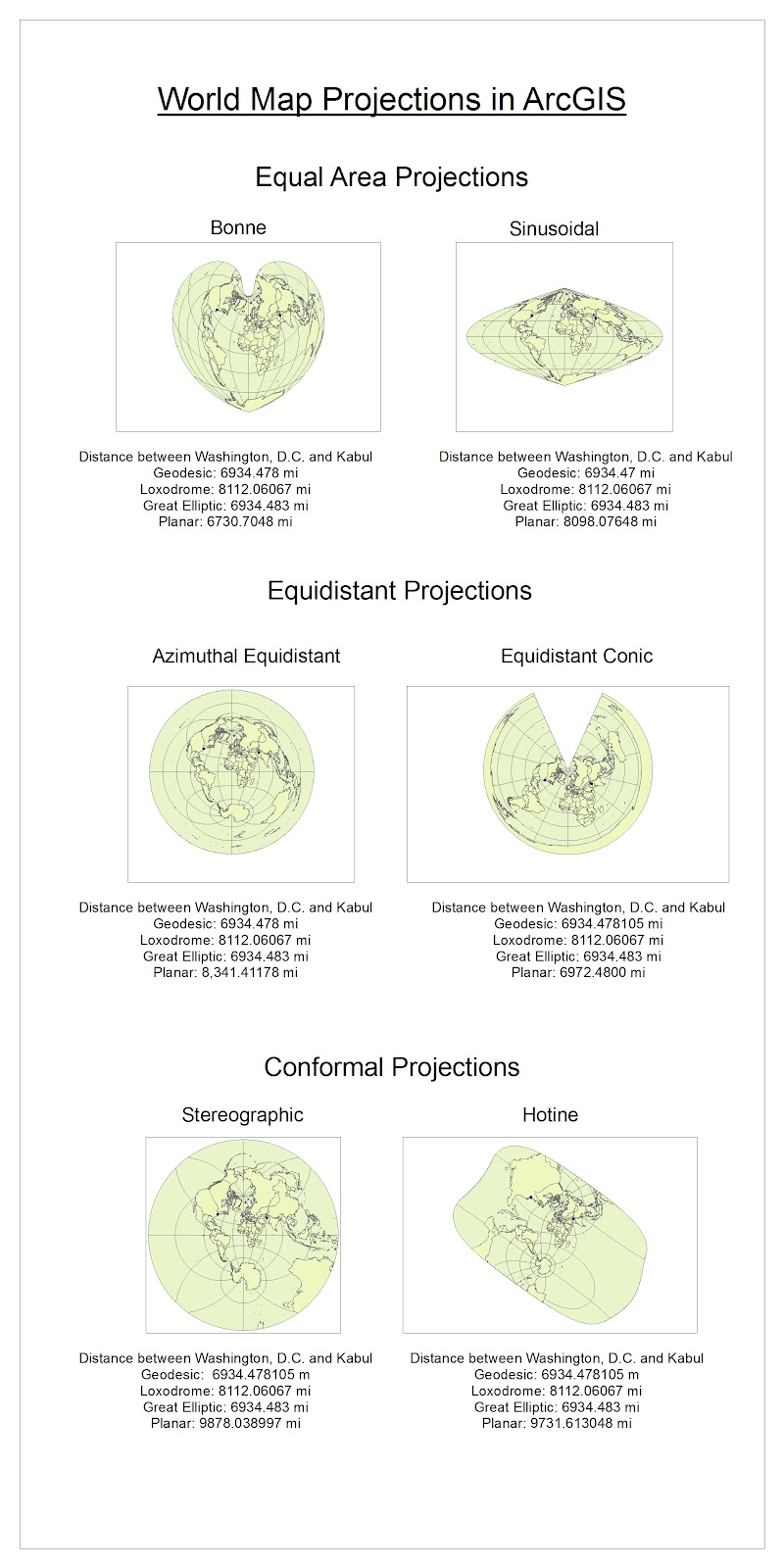
 | ||
| The above map shows black population as a percent of the total population by county with data provided by Census 2000. According to the data and this map, the highest percentages of black individuals by county are located in the southeastern United States. In addition to the counties with the largest percentage of African American being concentrated in the South, the map displays an interesting trend within the region. The counties with the highest percentage black populations lie in the center of the region and overall become increasingly “less black” moving out from the South. This pattern suggests that African-American populations could have diffused out from original high concentrations in the center of the South. It is also possible that large numbers of African-American individuals have moved from outlying regions into these “blacker” counties, thus raising the percentages of blacks in those counties. The data presented in this map aligns with the country’s history as African Americans were brought to the South as slaves. While the South is generally thought of as having a large percentage of blacks, it interesting to see that even a century and a half after slavery was outlawed, these southern counties still have such high concentrations of African-American individuals. |
 |
| The above map shows counties of the contiguous United Sates with Asian alone populations greater than zero ranked by percent with data from Census 2000. Whereas the previous map shows counties with high percentages of African-Americans concentrated in a geographic region, this map shows high percentages of Asians in counties of global urban centers and city-regions, notably New York, San Francisco, and Los Angeles. As on the map of counties ranked by African-American populations, this map shows counties of high Asian populations surrounded by increasingly less-Asian counties. California and Washington have noticeably more counties with Asians and with higher percentages of Asians than the rest of the country. This makes sense because the West Coast is the region of the United States that is closer to Asia. Unlike the previous map, however, this map shows isolated counties with significant Asian populations scattered across the nation, especially in the Midwest. To me this provokes questions of how and why these scattered inland counties have such high percentages of Asians and what culture in those counties is like, especially compared with the surrounding counties. I also found it interesting that so many counties in the United States have almost non-existent Asian populations as shown by the beige color on the map. |
 |
The above map shows counties of the contiguous United Sates
with “some other race” alone populations greater than zero ranked by percent
with data from Census 2000. According
the Census Bureau for Census 2000, the label “some other race alone” indicates an
individual who identifies with one specific racial group besides the five
minimum race categories required by the Federal Office of Management and Budget
which are: White alone, Black or African-American alone, American Indian or
Alaska Native alone, Asian alone, and Native Hawaiian or other Pacific Islander
alone. The lack of a required Hispanic/Latino
race category and the high population percentages shown in counties in the
United States Southwest, especially along the US-Mexico border imply that these
counties do indeed depict counties with significant Hispanic/Latino
populations. Personally having lived my
entire life in California, first in areas of agriculture in northern California
and now in Los Angeles, it is shocking to me that so much of the United States
has so many counties with very low percentages of individuals who identify as
some other race alone.
Conclusion on Census Map Series:
I thoroughly enjoyed this lab assignment and am satisfied with the resulting map series. Although this map series is fairly straightforward and for a lab assignment, making these maps felt productive and important. Being able to see collected data expressed over space, both helps better me understand the information and realize the existing knowledge that I have but may not consciously consider. I think that even without titles and legends, I, and several others, would be able to identify which map depicts the population percentages of each racial group. Although expressing Census population data on ArcGIS’s maps appears both visually pleasing and helpful, it does have some shortcomings. While these maps do illustrate ranked percentages of racial groups in space, they do not completely show which counties have the highest (or lowest) actual numbers of these groups. A county that appears to have a high Asian alone population, for example, may in reality only have a few Asian residents but they could make up a significant percentage of a small total population. More complicated maps, accompany data tables, and/or using multiple complimentary and related maps could most likely overcome this pitfall of this map series and more truthfully display demographic data over space. Another shortcoming, more of the Census than these maps, is the reliance on individuals to truthfully and accurately report their respective races. Binary categories, confusion over labels and instructions, and overall participation in the Census could skew results and lead to inaccurate maps. Because these maps focus on racial groups, it is possible that the information is even more inaccurate because of language barriers or immigration and residency status that deters or discourages participation by the entire population. My overall impressions of GIS are very similar to my conclusion from this lab assignment. I think the discipline is both fascinating and fun, but I realize that its limitations must be realized and accepted, if not challenged, in order to effectively use and understand GIS. GIS is an incredibly useful tool that can be used by individuals and professionals in several various fields. I think that being able to visualize data over space makes the data easier to understand and intensifies its importance or main point. Additionally, GIS can lead to new realizations or spur new queries and further research. In this lab assignment, for example, joining the Census racial data to the mapped counties provoked questions for me about distribution of racial groups and the resulting cultures. Although GIS is a powerful and effective tool, it is crucial to be aware of its pitfalls and challenges in order to best use GIS. Patience and conciousness may be necessary to read GIS data correctly. For example, it is important to realize that this lab assignment illustrates racial populations as perecetages and not absolute numbers, as mentioned above. By maintaining awareness and cautiousness when using GIS, I truly think that individuals can better understand data, space and place, and the significane of spatial phenomena. |


