Friday, June 15, 2012

Lab 8: Mapping the Station Fire in ArcGIS

Reference Maps: Extent of the 2009 Station Fire and Los Angeles County School Districts bordering the Station Fire

Theme Map: Los Angeles County Schools and School Districts that closed schools or limited outside activity during the 2009 Station Fire


According to the USDA Forest Service, the Station Fire began around 3:15 pm PST on Wednesday, August 26, 2009 near the Angeles Crest Fire Station.  The Station Fire’s starting point was located on the Angeles Crest Highway in the southern region of Angeles National Forest, north of the cities of Glendale and Los Angeles.  According to ABCnews Los Angeles, the fire began spreading rapidly on the afternoon of Thursday, August 27.  As seen by the above maps, the fire spread several miles to the north, east, and west, but very little south.  The fire initially spread to the north and west, as seen by its extent at 0025 on August 30, 2009.  The fire continued spreading west throughout its expansion, but began spreading much further east as well, as exemplified in the above maps by the fire’s extents as of 2114 on August 30, 2009 and 0702 on September 2, 2009.  The Station Fire first spread north and northwest, and then continued growing eastward.  The fire burned mostly in Angeles National Forest, but affected urban areas outside the forest boundary as well.  The Station Fire covered the largest extent of its area between August 30 and September 2, 2009 as shown by these maps.  Given the spreading fire pattern, areas to the north of the fire’s starting point were under the greatest threat.  The more populated areas of Los Angeles County, along with the county’s most schools, however, lie south of the fire.  
On September 3, 2009, officials announced arson as the cause of the fire.  By September 19, 2009, firefighting efforts had contained 91 percent of the fire, as reported by InciWeb.  The Station Fire was 100 percent contained by 7:00 pm PST on Friday, October 16, 2009 due to moderate rainfall in addition to prolonged efforts by firefighters.  By the time it was contained, the Station Fire had burned 160,557 acres (649.75 km2 ; 251 square miles), making it the largest wildfire in the history of Los Angeles County and the tenth largest in the history of modern California, according to the Los Angeles Times. 
            This theme map shows that Los Angeles County schools were affected by the Station Fire by school closures or limitations in school activities.  The Station Fire began before most Los Angeles County schools were in session.   For this reason, no schools had to be actively evacuated, but some school openings were delayed.  As of 8:13 pm on Saturday, August 29, a little over three days since the fire’s ignition, the Pasadena Star-News reported that all thirty Glendale Unified schools would remain closed through that coming Wednesday, even though classes were supposed to start on Monday, August 31.  On August 30, the LAist website reported that La Canada Unified schools would also be postponing their August 31 scheduled opening, and would open on Tuesday, September 1. According to InciWeb, the fire was only 5 percent contained at 9:00 pm PST on August 31, 2009.  LCUSD would continue to suspend outdoor athletic activities until air quality improved.  Outdoor athletic activities were also suspended in Pasadena Unified and Los Angeles Unified, but schools were not yet in session in these districts.  In Santa Clarita, William S. Hart Union High School District and Sagus Union School District remained open and no suspensions of outdoor activities were found for this report.  Acton-Agua Dulce Unified, to the north of the fire, was not yet in session during the Station Fire’s peak.  Pasadena City College remained open, but promised to hold enrollment spots for students affected by the fire, according to Star-News.  Glendale Community College also continued holding regularly scheduled classes.  Schools in these districts that took action because of Station Fire threats are represented by aqua points on the theme map.  Only one school, Gateway School, was within the perimeter of the Station Fire at any time.  It is unclear from available internet sources, however, if the Gateway School was destroyed by the fire. 
During the Station Fire, some urban regions of Los Angeles County were evacuated because the fire was labeled a direct threat to these areas and their residents.  Some Los Angeles County Schools were designated as evacuation centers, most likely because of their capacity, accessibility, and well-known locations.  On Monday, August 31, ABCnews Los Angeles named La Canada High School, La Crescenta Valley High School, Golden Valley High School, and Verdugo High School as emergency evacuation centers.  These schools are indicated on the theme map by lime green octagons.  The use of schools as evacuation centers could further contribute to closures or delays in school openings. 
From this theme map and the information provided on school closures, activity restrictions, and use of schools as evacuation centers, we can make the hypothesis that wildfires can severely affect daily life even when the fire is not a direct physical threat to the region’s buildings and residents.  School closures have several civic ramifications, including affecting taxes, federal funding, the academic calendar, and education schedules.  Further implications of school closures could include altering family schedules, childcare needs, access to meals, and disadvantaging students participating in large-scale academic pursuits including national tests, e.g. the SAT, college applications, and inter-district or interregional academic or athletic competitions.  Poor air quality caused by the fire limited outdoor athletic activities in multiple school districts, supporting the hypothesis that areas far beyond the actual burned regions are affected by fires.  Evacuations of nearby areas, the need for emergency evacuation centers, road closures, and poor air quality restricting travel or activities are  indirect aspects of wildfires which have very real consequences for school districts and thus for daily life. 
It is important to acknowledge some limitations of availability of information about school closures and evacuations caused by the Station Fire.  Because the Station Fire is no longer current news, it was sometimes difficult to find updates about its threat and spread online.  Information about evacuations and school closings were particularly elusive; often news sites provide a phone number to call for updates or have a link to a page which once had updates of closures and evacuations but is no longer accessible via the web.  


Works Cited
"2 Firefighters Killed Battling Station Fire." Abclocal.go.com. ABCnews, 30 Aug. 2009. Web. 15 June 2012. .
"53 Structures Burned in Station Fire." Abclocal.go.com. ABCnews, 31 Aug. 2009. Web. 15 June 2012. .
Barge, Evelyn. "UPDATED 4:30 P.m. Wednesday: Station Fire Resources and Blogroll for Up-to-minute Information." Insidesocal.com/rose. Rose Magazine, Pasadena, California, 29 Aug. 2009. Web. 15 June 2012. .
Bloomekatz, Ari B. "Station Fire Is Largest in L.A. County's Modern History." Web log post. Latimesblogs.latimes.com. Los Angeles Times, 2 Sept. 2009. Web. 15 June 2012. .
City of Glendale. STATION FIRE UPDATE AUGUST 30, 2009 5:00 PmCi.glendale.ca.us. City of Glendale, 30 Aug. 2009. Web. 15 June 2012. .
City of Glendale. STATION FIRE UPDATE AUGUST 31, 2009 10:00 AmCi.glendale.ca.us. City of Glendale, 31 Aug. 2009. Web. 15 June 2012. .
Hubbard, James E., Tom Harbour, John B. Tripp, Ken Pimlott, and Donald G. MacGregor. Fire and Aviation Management Station Fire Initial Attack Review: Report of the Review Panel. Rep. N.p.: USDA, 2009. Fire and Aviation Management Station Fire Initial Attack Review: Report of the Review Panel. USDA Forest Service, 13 Nov. 2009. Web. 15 June 2012. .
"Station Fire News Release." Inciweb.org. InciWeb Incident Information System, 31 Aug. 2009. Web. 15 June 2012. .
William-Ross, Lindsay. "Station Fire Update: Evacuations, School Closures & Other Info." LAist.com. Gothamist LLC, 30 Aug. 2009. Web. 15 June 2012. .


Thursday, May 31, 2012

Lab 7: Census 2000


The above map shows black population as a percent of the total population by county with data provided by Census 2000.  According to the data and this map, the highest percentages of black individuals by county are located in the southeastern United States.  In addition to the counties with the largest percentage of African American being concentrated in the South, the map displays an interesting trend within the region.  The counties with the highest percentage black populations lie in the center of the region and overall become increasingly “less black” moving out from the South.  This pattern suggests that African-American populations could have diffused out from original high concentrations in the center of the South. It is also possible that large numbers of African-American individuals have moved from outlying regions into these “blacker” counties, thus raising the percentages of blacks in those counties.  The data presented in this map aligns with the country’s history as African Americans were brought to the South as slaves. While the South is generally thought of as having a large percentage of blacks, it interesting to see that even a century and a half after slavery was outlawed, these southern counties still have such high concentrations of African-American individuals.


The above map shows counties of the contiguous United Sates with Asian alone populations greater than zero ranked by percent with data from Census 2000.  Whereas the previous map shows counties with high percentages of African-Americans concentrated in a geographic region, this map shows high percentages of Asians in counties of global urban centers and city-regions, notably New York, San Francisco, and Los Angeles.  As on the map of counties ranked by African-American populations, this map shows counties of high Asian populations surrounded by increasingly less-Asian counties.  California and Washington have noticeably more counties with Asians and with higher percentages of Asians than the rest of the country.  This makes sense because the West Coast is the region of the United States that is closer to Asia.  Unlike the previous map, however, this map shows isolated counties with significant Asian populations scattered across the nation, especially in the Midwest.  To me this provokes questions of how and why these scattered inland counties have such high percentages of Asians and what culture in those counties is like, especially compared with the surrounding counties.  I also found it interesting that so many counties in the United States have almost non-existent Asian populations as shown by the beige color on the map. 
The above map shows counties of the contiguous United Sates with “some other race” alone populations greater than zero ranked by percent with data from Census 2000.  According the Census Bureau for Census 2000, the label “some other race alone” indicates an individual who identifies with one specific racial group besides the five minimum race categories required by the Federal Office of Management and Budget which are: White alone, Black or African-American alone, American Indian or Alaska Native alone, Asian alone, and Native Hawaiian or other Pacific Islander alone.  The lack of a required Hispanic/Latino race category and the high population percentages shown in counties in the United States Southwest, especially along the US-Mexico border imply that these counties do indeed depict counties with significant Hispanic/Latino populations.  Personally having lived my entire life in California, first in areas of agriculture in northern California and now in Los Angeles, it is shocking to me that so much of the United States has so many counties with very low percentages of individuals who identify as some other race alone.


Conclusion on Census Map Series:

I thoroughly enjoyed this lab assignment and am satisfied with the resulting map series.  Although this map series is fairly straightforward and for a lab assignment, making these maps felt productive and important.  Being able to see collected data expressed over space, both helps better me understand the information and realize the existing knowledge that I have but may not consciously consider.  I think that even without titles and legends, I, and several others, would be able to identify which map depicts the population percentages of each racial group.  Although expressing Census population data on ArcGIS’s maps appears both visually pleasing and helpful, it does have some shortcomings. While these maps do illustrate ranked percentages of racial groups in space, they do not completely show which counties have the highest (or lowest) actual numbers of these groups.  A county that appears to have a high Asian alone population, for example, may in reality only have a few Asian residents but they could make up a significant percentage of a small total population.  More complicated maps, accompany data tables, and/or using multiple complimentary and related maps could most likely overcome this pitfall of this map series and more truthfully display demographic data over space.  Another shortcoming, more of the Census than these maps, is the reliance on individuals to truthfully and accurately report their respective races.  Binary categories, confusion over labels and instructions, and overall participation in the Census could skew results and lead to inaccurate maps.  Because these maps focus on racial groups, it is possible that the information is even more inaccurate because of language barriers or immigration and residency status that deters or discourages participation by the entire population. 


My overall impressions of GIS are very similar to my conclusion from this lab assignment.  I think the discipline is both fascinating and fun, but I realize that its limitations must be realized and accepted, if not challenged, in order to effectively use and understand GIS.  GIS is an incredibly useful tool that can be used by individuals and professionals in several various fields.  I think that being able to visualize data over space makes the data easier to understand and intensifies its importance or main point.  Additionally, GIS can lead to new realizations or spur new queries and further research.  In this lab assignment, for example, joining the Census racial data to the mapped counties provoked questions for me about distribution of racial groups and the resulting cultures.  Although GIS is a powerful and effective tool, it is crucial to be aware of its pitfalls and challenges in order to best use GIS.  Patience and conciousness may be necessary to read GIS data correctly.  For example, it is important to realize that this lab assignment illustrates racial populations as perecetages and not absolute numbers, as mentioned above.  By maintaining awareness and cautiousness when using GIS, I truly think that individuals can better understand data, space and place, and the significane of spatial phenomena.     

Thursday, May 24, 2012

Lab 6: DEMs in ArcGIS


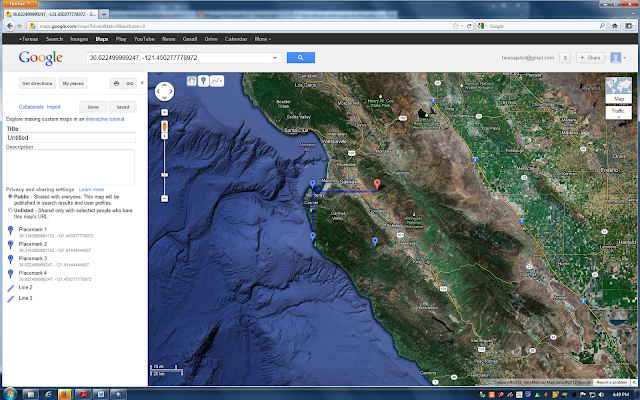
This area is south of Monterrey Bay, directly south of the city of Salinas. It includes Toro Park, Laguna Seca Recreation Area, and the Carmel Valley. This area also includes part of Garrapata State Park; parts of the cities of Monterrey, Carmel, and Gonzales; and sections of the 101 and 1 Freeways. The area is about 21 miles North-South by about 26 miles East-West as very roughly approximated on GoogleMaps. The land contained by this area is utilized for a myriad of uses, including urban and suburban development, a military housing complex, a presidio, recreation areas, golf courses, parks, agriculture, an airport, and roads. The top left corner includes an area of Monterrey Bay and the bottom left corner includes a piece of the Pacific Ocean. The topography varies greatly across the area with hills and valleys.

The approximate location of this area is shown on this GoogleMap image.  The four points represent the four corners of the area's extent given by the DEM model.


The extent information in decimal degrees of this area is described in the DEM model as:
Top: 36.622499999247
Left: -121.91444444567, Right: - 121.450277778972
Bottom: 36.3163888881153

This area is defined by the Geographic Coordinate System North American 1983.

3D Image


Friday, May 18, 2012

Lab 5: Projections in ArcGIS


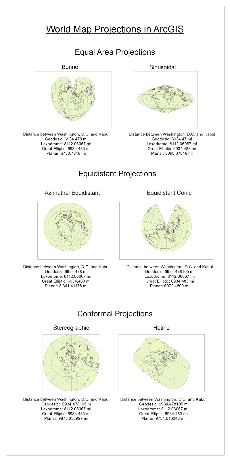
The variety of map projections and range of layouts and types within each projection category provide several opportunities for how to present geographic information.  For example, both the Bonne and Sinusoidal projections are equal are projections, meaning that they preserve the relative areas of continents and oceans on their maps.  Even so, the two projections appear very different from one another so could be preferred for different presentations of information or other uses.  The sheer number of available map projections mean that users have several options for selecting a projection that best fits a specific use.   

This same extent of options, however, can make choosing and understanding map projections difficult.  Certain map projections are surely better suited for particular purposes, but it can be hard to decide which map projection is most accurate or should be widely used.  The contortion of the graticule on some projections could make locating a point or determining distance especially difficult. 

In addition to complicating decisions about map usages, map projections can make thinking about the real world confusing.  Knowing which distances are accurate can be difficult, especially with limited knowledge of map projections or measurement types.  It is easier to understand why the Planar measurement changes projection to projection, but difficult to know when the Planar measurement is an accurate representation of distance.  Because the Geodesic and Great Elliptic measurements remained constant throughout the six projections and similar to one another, it seems reasonable to assume that the distance between Washington, D.C. and Kabul is indeed about 6,934.48 miles.  The Loxodromic measurement also remained constant across all the projections though, but gave a distance of 8,112.06 miles between the two cities.  The difference between the Loxodromic and Geodesic/Great Elliptic measurements is so great that it definitely can cause confusion about map projection measurements and possibly even uncertainty about the actual distance separating Washington, D.C. and Kabul.  

Because of these potential pitfalls, users must be especially when choosing and reading world maps.  Both map makers and users should be aware of the projection type, preserved properties, and contorted properties in order to read the map correctly.  Only being informed of the variety and staying alert to potential challenges, can we most effectively and truthfully convey and understand geographic information on map projections.  Once these pitfalls are understood and users cautioned, however, the range of available map projections can be utilized to most accurately and easily express geography. 

Friday, May 11, 2012

Week 4-6 Lab


ArcGIS has both many advantages and disadvantages. Its huge capacity and attention to detail make it incredibly applicable and useful, but this same complexity can limit its audience.  Regardless of these pitfalls though, ArcGIS’s storage capacity and the number of different things its users can look of and express with the software is amazing.  I was in awe of how much data and different types of data are available through the software, and as I worked through the tutorial I was excited and a little intimidated about using the software for a variety of applications. 

In addition to providing so much information, ArcGIS lets that information be presented in a clear and professional way.  The editor tool bar and ability to set colors and positions in every map, graph, and poster let the data appear clean and easy to read.  By editing and organizing the information, ArcGIS presentations can be accessible and understandable to individuals of varying knowledge and experience who can benefit the information.

Although ArcGIS is incredibly useful and informative; in some cases it can only benefit a certain group of people.  Both creating and reading ArcGIS maps and all of the information stored in the entities’ attributes require a significant level of computer literacy.  Individuals without high computer skills cannot take full advantage of ArcGIS’s expansive and intricate information and capabilities.  ArcGIS probably needs to be computer intensive to be able to do everything it does, but even so, it excludes a group of people who could potentially have high geospatial or social knowledge and insight that could greatly benefit society when applied to GIS technology. 

ArcGIS software is incredibly expensive and constantly being updated.  The high cost of the software further excludes individuals who may have useful geographic knowledge and/or computer skills but are unable to afford ArcGIS.  ArcGIS’s price in combination with its prevalence in the GIS field to some extent make GIS an elite field, requiring individuals to have experience with the expensive program and companies to buy the software.  The fact that ArcGIS constantly releases new versions requires that individuals and companies must continue purchasing and learning to use the software.

Friday, April 27, 2012

Lab 3: Neogeography

Biking Tour of Davis, California
View Biking Tour of Davis, CA in a larger map


By letting individuals create and update public maps, neogeography lets people literally everywhere share information with one another and makes a whole new type of knowledge broadly and easily accessible.  Individuals can add local advice or tourist input that may not be advertised through publicly distributed information or official records.  Using neogeography opens infinite opportunities for sharing experiences and advice relating to geographic locations.  By using pre-existing mapping toolkits and providing instructions, map programs such as Google Maps let almost anyone basic computer knowledge share their geographic experiences.  Individuals do not have to have advanced cartography skills to share their knowledge about places and locations. 

These same elements of neogeography, however, can also lead to potential problems and misuse of easily sharing geographic experiences.  Because anyone can create and access such online maps, individuals with poor or wrong information can appear professional and knowledgeable through the easy to use and stylized toolkit of Google Maps.  This could cause later map viewers to become confused or misinformed and possibly take bad advice that could put them in a less than enjoyable or even dangerous situation.  By providing limited options for features and details in the toolkit, such mapping toolkits can actually contribute to misinformation.  For example, on my bike tour map I wanted to put a stop at the dairy barn on UC Davis campus.  There were no options for “farm” or “cows” on the legend though, so I marked the location with a man on horseback even though there are no horses or opportunities for riding at the dairy barn.  Because of the potential problems that come hand in hand with the advantages of neogeography, it is essential to remember that other individuals are creating and altering maps.  Therefore, it is every neogeographer’s responsibility to create maps responsibility and read maps with caution.    

Friday, April 20, 2012

Week 2: USGS Topographic Maps


1) This is the Beverly Hills quadrangle. 
2) The adjacent quadrangles are Canoga Park, Van Nuys, Burbank, Topanga, Hollywood, Venice, and Inglewood.  The Pacific Ocean is also adjacent to the Beverly Hills quadrangle. 
3) This quadrangle was first created in 1966.

4) The datum used to create this map are the North American Datum of 1927, North American Datum of 1983, and the National Geodetic Vertical Datum of 1929.
5) The map scale is 1:24000
6) Scale
a) 5 cm on the map is equivalent to 1200 m on the ground.
b) 5 in on the map= 1.8939 miles on the ground
c) one mile on the ground = 2.64 in on map
d) three km on the ground = 12.5 cm on map

7) Contour interval = 20 ft with supplementary contour interval of 10 feet
8) Geographic Coordinates
a) Public Affairs Building
                  Degrees/Minutes/Seconds: 34 degrees 4’ 30’’N, 118 degrees 26; 15’’W
                  Decimal Degrees: 34.075 degrees N, -118.4375 degrees E
b) the tip of Santa Monica Pier
                  DMS: 34 degrees 0’30’’ N, 118 degrees 30’ W
                  DD: 34.0833 degrees N, -18.5 degrees E
c) Upper Franklin Canyon Reservoir
                  DMS: 34 degree 6’15’’ N, 118 degrees 25’15’’ W
                  DD: 34.1042 degrees N, -118.42083 degrees E

9) Elevation
a) Greystone Mansion: 560 feet, 170 meters

b) Woodlawn Cemetery: 140 feet, 42 meters

c) Crestwood Hills Park: 700 feet, 213 meters

10) UTM Zone 11
11) The UTM coordinates for the lower left corner are 37^63
12) Each cell of the UTM gridlines contains 1,000,000m^2

13) Elevation Profile along the UTM northing 3771000: (elevation is given in meters)


14) The magnetic declination of the map is 14 degrees. 

15) The water in the intermittent stream between the 405 freeway and Stone Canyon Reservoir flows south because elevation decreases from north to south.


16) UCLA from the topographic map

Friday, April 13, 2012

Week 1 Lab: Interesting Maps


This map shows the worldwide distribution of malaria from 1900-2002.  More specifically, it shows the results of the intentional eradication programs during the 20th century.  While malaria was found throughout the Northeastern United Sates and across Europe and Russia, the disease is now concentrated in the global South. 

I find this map interesting because it shows that some areas where malaria was once endemic have now eradicated the disease.  Although the map specifically shows a spatial distribution of disease, it also implies information about the distribution of socioeconomic factors.  For the most part, the areas in the global north that have eradicated malaria over the past century are also relatively wealthy nations with access to knowledge and resources to wipe out the disease.
I am interested in how climate change will affect the distribution of communicable diseases and how these changes could affect populations worldwide.  Using this map with a map of changing global temperatures and/or a map of the unintentional changes in malaria distribution could provide valuable information about the nature of malaria and future of the disease.  

This map is from the Marian Koshland Science Museum of the National Academy of Sciences website.  It is located under the Vector Control and Malaria tab in the Infectious Disease section at the url http://www.koshland-science-museum.org/exhib_infectious/malaria_vector_control_05.jsp


_____________________________________________________________


This map shows the various products that are produced in different Central American countries.  This product map is definitely oversimplified; it shows neither where each good is produced within each country nor all of the important products from each country.  Even so, I think it is extremely interesting and important to realize that many commodities come from Central America, especially as global commodity chains lengthen and different regions of the world become increasingly economically interconnected.  I am personally interested in economics and Latin America so I like being able to see the distribution of commodities geographically. While this map is not extremely detailed, such an oversimplified image can be a convenient and accessible way to begin research or further investigation on a topic.

This map is from the website classbrain.com and is located under "Central America" under "Country Reports."  It was published by the ClassBrain staff and is found at the url http://www.classbrain.com/art_cr/publish/central_america_product_map.shtml.


_____________________________________________________________


This map is a screenshot I took from an online interactive map which shows the number of medals won by each country competing in the 2008 Olympic Games in Beijing.   The sizes of the circles correspond to the number of medals won.

I think it is especially interesting that this map arranges the medal winners geographically.  Instead of simply listing country rankings, it is easy to see which parts of the world the Olympic champions come from and how one nation's medal tally compares to those of its neighboring countries. 

The interactive map has a slider which one can move to see the medal distribution from each Summer Olympic Games since 1896.  More nations participate in the Games and win medals in more recent years.  Additionally, the distribution of medals in some years show interesting phenomena and information not explicitly given.  In the 1980 Games for example, East Germany and the Soviet Union dominated the podium while several prominent countries including the United States apparently won no medals.  Although the map does not provide text explaining this anomaly, it is clear that something out of the ordinary happened surrounding the 1980 Games.  Indeed, the United States and many other nations boycotted the 1980 Moscow Games to protest the Soviet Union's invasion of Afghanistan.  I find it absolutely fascinating how in addition to statistics about athletic rankings, this map contains a plethora historical information and economic, cultural, and political implications.

The interactive map can be accessed at:  http://www.nytimes.com/interactive/2008/08/04/sports/olympics/20080804_MEDALCOUNT_MAP.html